 |
| I'm Impressed by Jake & Noel on Etsy |
Today's mini critique is for SilverSmack, and she wants to know what the overall impression is of her shop.
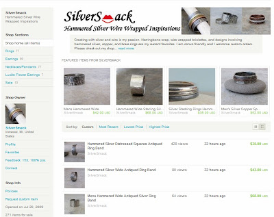
So since this is a little different than a normal critique, here's what I'm going to do. I'm going to show you a screenshot of SilverSmack's shop, give my two cents on the impression that her shop gives me, and then leave you with a check list to use on your own shop so you can see what kind of impression you're leaving for your customers.
~*~*~*~*~*~*~*~*~*~*~*~*~*~*~*~*~*~*~*~*~*~*~*~*~*~
Here's what I see:
- pics - sell silver jewelry that's hammered & worn {not polished}
- prices - midrange & affordable
- listings - You're a serious shop. You have a business. You're a professional not hobbiest. I can see this because you have a lot of listings, you list frequently, & you have regular sells.
- sections - you offer a variety of jewelry
My thoughts on your shop:
- title - it says "inspiration"...I'd change that to "jewelry" because when that shows up in a Google Search, people won't know what you make from the word inspiration
- banner - you only have pics of your rings. Since you make other pieces of jewelry too, I'd add a pic of a necklace & earrings as well as a ring.
- listing photos - look nice. Nice backgrounds & props...in some photos, the colors of the jewelry are competing with the color of your background {gray on gray or white on white}.
- descriptions - great use of links. I did notice that in some you weren't providing a link to your policies even though you were directing customers to them.
- SEO - looks like you've done well getting your shop optimized for SEO from the look of keywords used in your listing titles, descriptions, & shop announcement
My thoughts as a customer:
- return/exchange policy - I was excited to see that you offered lifetime repair on your jewelry! That makes me very comfortable buying from you!
- description links - like I said earlier...provide a link for me if you're directing me somewhere. Make it as easy as can be for me.
- description questions - Why do I need to order my ring a half size bigger than I wear? What does "oxidized" mean? It would be a good idea to answer any & every question a buyer may have.
- Profile bio or welcome - tell me about your crafting process. This helps me to value the product I may buy from you more. It also helps me to understand the price as well.
Great shop! Nice products! I feel like I know exactly what I'm getting from you & what to expect. I know that if I have any trouble or change my mind that you will work with me to meet my needs. I also like the fact that I can get anything custom made from you!
~*~*~*~*~*~*~*~*~*~*~*~*~*~*~*~*~*~*~*~*~*~*~*~*~*~
7 Ways to Leave a Good Impression with Your Shop
- Graphics & Pictures - high resolution, not grainy, styled & branded well, professional looking
- Copy - well written, no grammatical or spelling errors, provide all necessary info about product, answer any potential questions customer may have
- Bio - tell about yourself & how you got started in your craft & your shop, provide links to important places in your shop & on the web.
- Customer Service - appear friendly & easy going in your writing, tell how to contact you, let buyers know if you offer custom orders, make return/exchange policy clear
- Policies - well written, provide all necessary information, be specific
- Feedback - work to satisfy customers so you'll get great feedback. Good feedback makes customers feel comfortable buying from you
- Pricing - offer a range of prices so there's something for everyone
What do you do in your shop to provide customers with a "good impression"?
Meagan @BabySwank & @MeaganVisser.com


6 comments:
Awesome information that will help me with my shop too. SilverSmack's shop is fantastic!
wonderful, in-depth article - learned a bunch! love SilverSmack's shop too!
Thank you so much for the thorough and thoughtful "first impression" overview. I really appreciate it!
Jean/SilverSmack
No problem! I'm so glad that these critiques have been so helpful!
Great information thank you for the post. Writing good description is my biggest struggle for sure. I'm creative in so many aspects of my life, words however are a huge roadblock.
P.S. I do have a little feedback for SilverSmack. I am a graphic designer by trade and I hope I do not offend you, that is definitely not my intention, but I feel your banner is lacking somewhat. Kinda dull an unimpressive, Because most of your shop in white, gray, silver. I would jazz up the banner a bit with some color. just an observation, being a graphic designer, I notice these thing, lol. Much Love, Jodi
I didn't know about this blog. So glad I found it. Tons of great info in here. Will keep coming back. Thank you!
Post a Comment